
Proof Line Farm
Janan and Steve reached out for assistance with branding and logo design for Proof Line Farm. They run a small family farm store and creamery just minutes north of London, Ontario.
Proof Line Farm’s modern and forward-thinking approach to the food system and agriculture is what inspired a re-brand of their family-run farm. This focus on sustainability, along with goals to make fresh, local food more accessible and integrative, is what sets them apart from other farm stores or markets in the area. Looking into the future, this family business is all about growth and innovation.
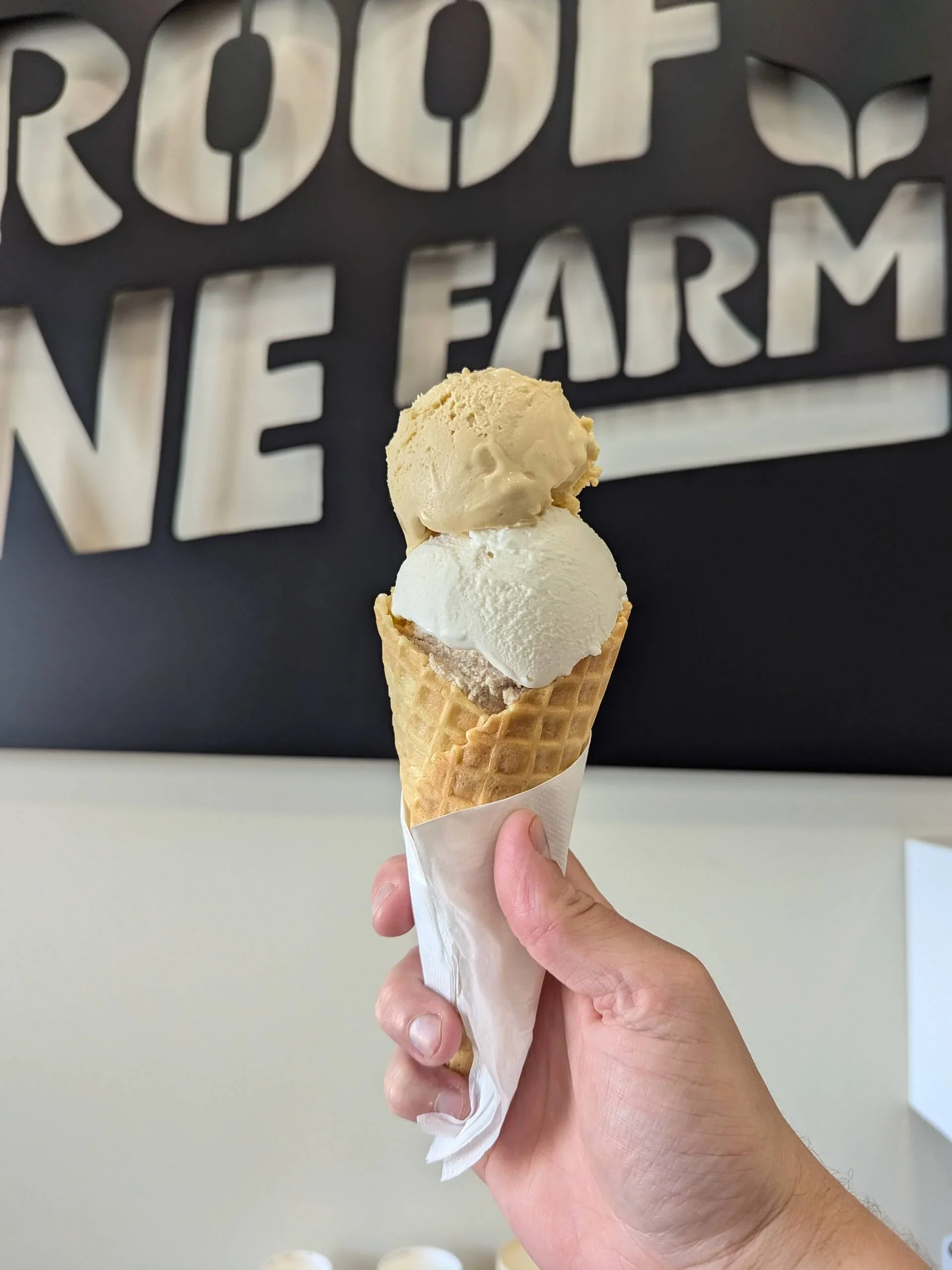
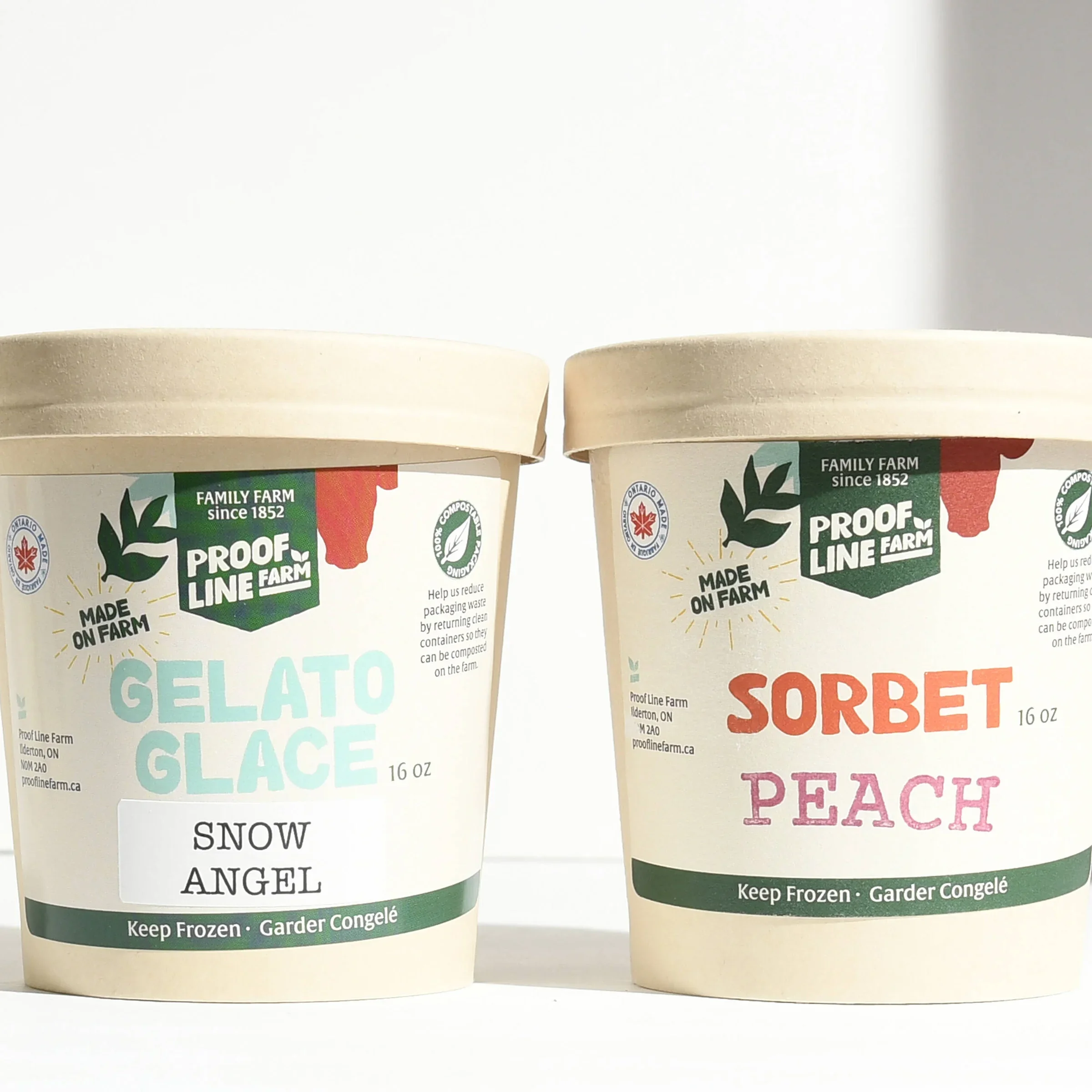
With the opening of the creamery, it’s the perfect time to launch their shiny, new brand identity. Proof Line Farm will now bring more fresh local food options to London and surrounding communities, including their very own line of gelato. Get ready for some tasty local eats!
Client
Proof Line Farm
Location
London, Ontario
Services
Brand Identity, Logo, Marketing


My Approach
The Challenge
Proof Line Farm wanted the logo and branding to take inspiration from their farm’s roots and the palette of the newly built creamery (red and black). The branding was to represent a farm that is friendly, modern, growth-oriented, and experiential. They really want locals from London, Ontario to experience the farm and learn where their food comes from. With this in mind, I knew I wanted to create a brand that was fun and forward-thinking.
The Solution
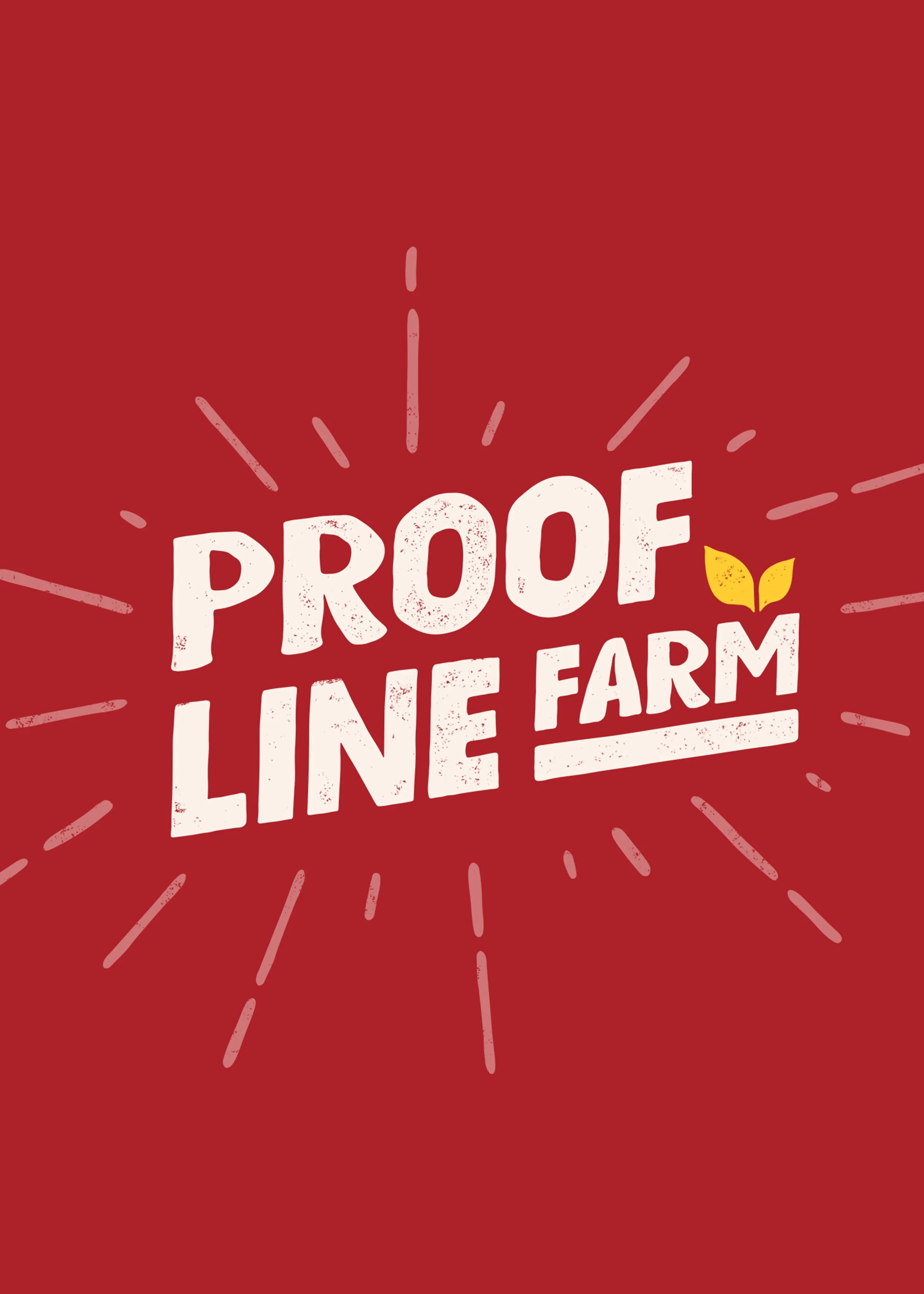
After multiple logo variations, and experimenting with many illustration styles, we settled on a bold, but approachable look, with a fun illustration-style font. This style makes it unique and easy to recognize. I also created different versions of the logo to work in full format or as an icon.
Logo Concept to Refinement
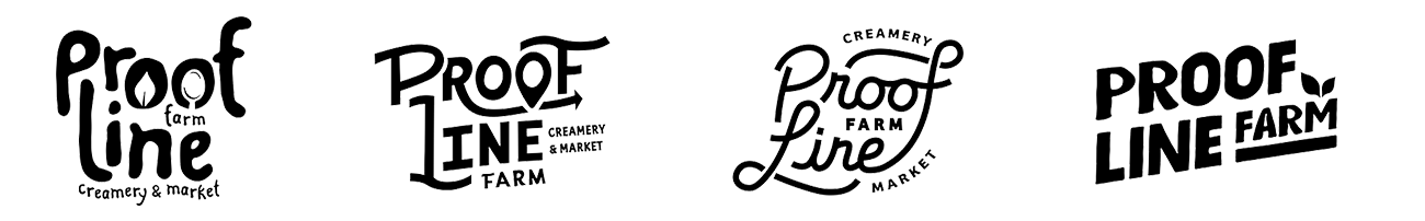
Below, I’ve included the beginnings of the farm logo design process. These are four rough logo concepts. I wanted to focus on the friendly, approachable vibe with lots of custom hand-drawn fonts. The first concept focuses on the “field to fork (spoon)” idea. The second emphasizes the forward route (arrow) and the location marker represents local. The third idea was a take on sustainability and regeneration (the infinity lines). The fourth is a clean, illustration-style typeface that focuses on growth with the sprout leaves. In this process, the fourth logo is the one that the Proof Line Farm wanted to further develop.
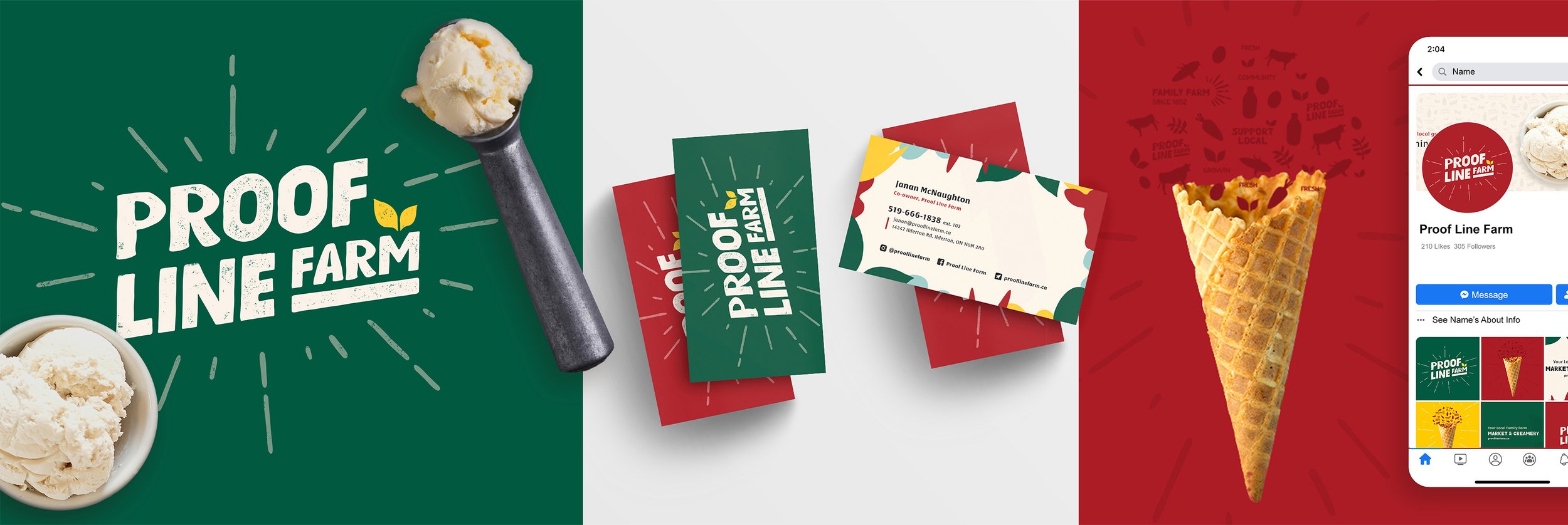
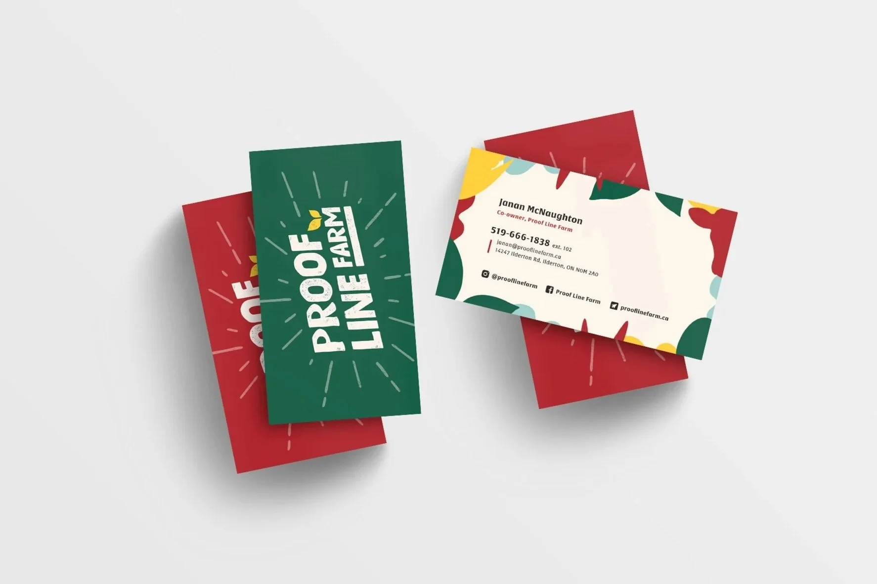
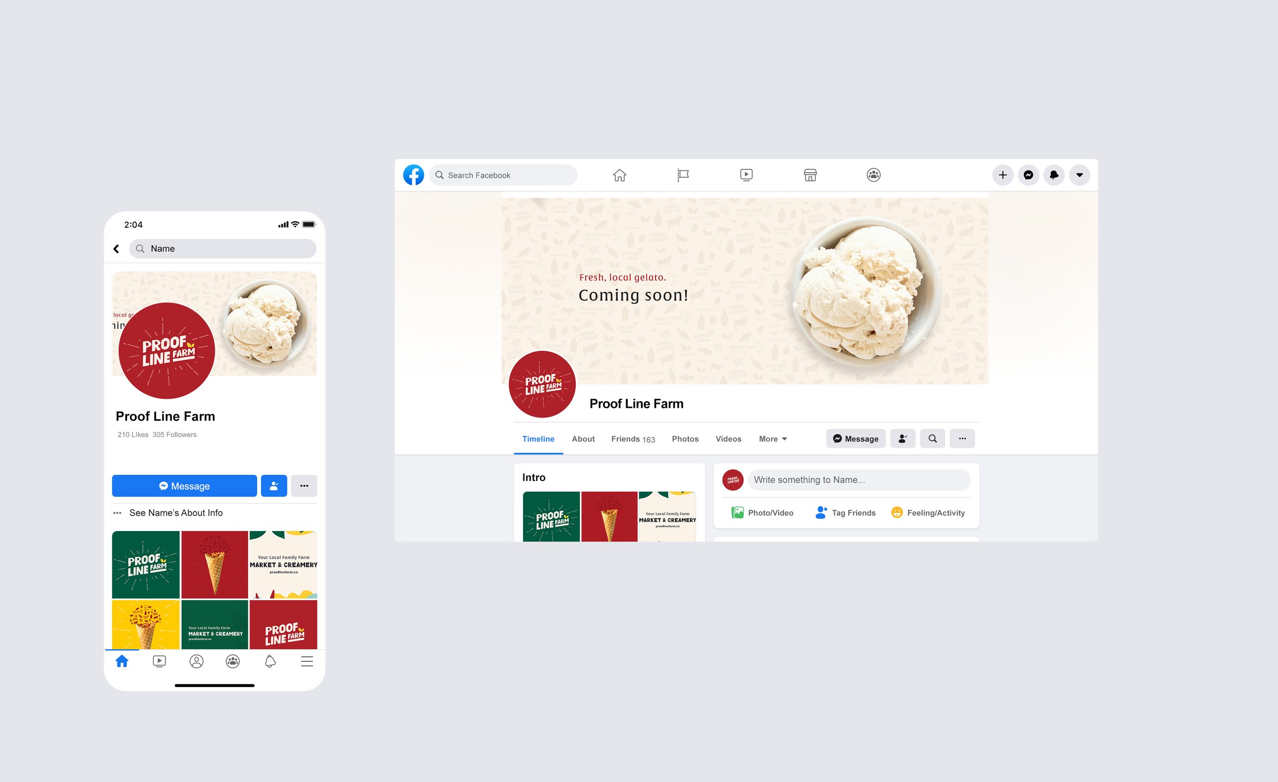
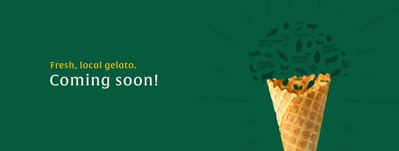
After choosing the logo direction, we also finalized the colour palette and other details of the brand’s visual identity, developing icons, patterns, textures, and supporting fonts. The bold colour palette makes the brand feel strong and established, with hints of brighter yellow for a fun, welcoming vibe. It really all comes together to showcase Proof Line Farm as a forward-thinking, approachable family farm. I have included examples of business card designs and social media banners.


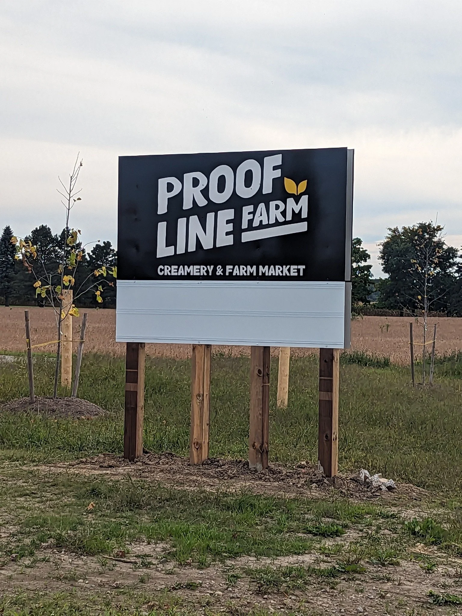
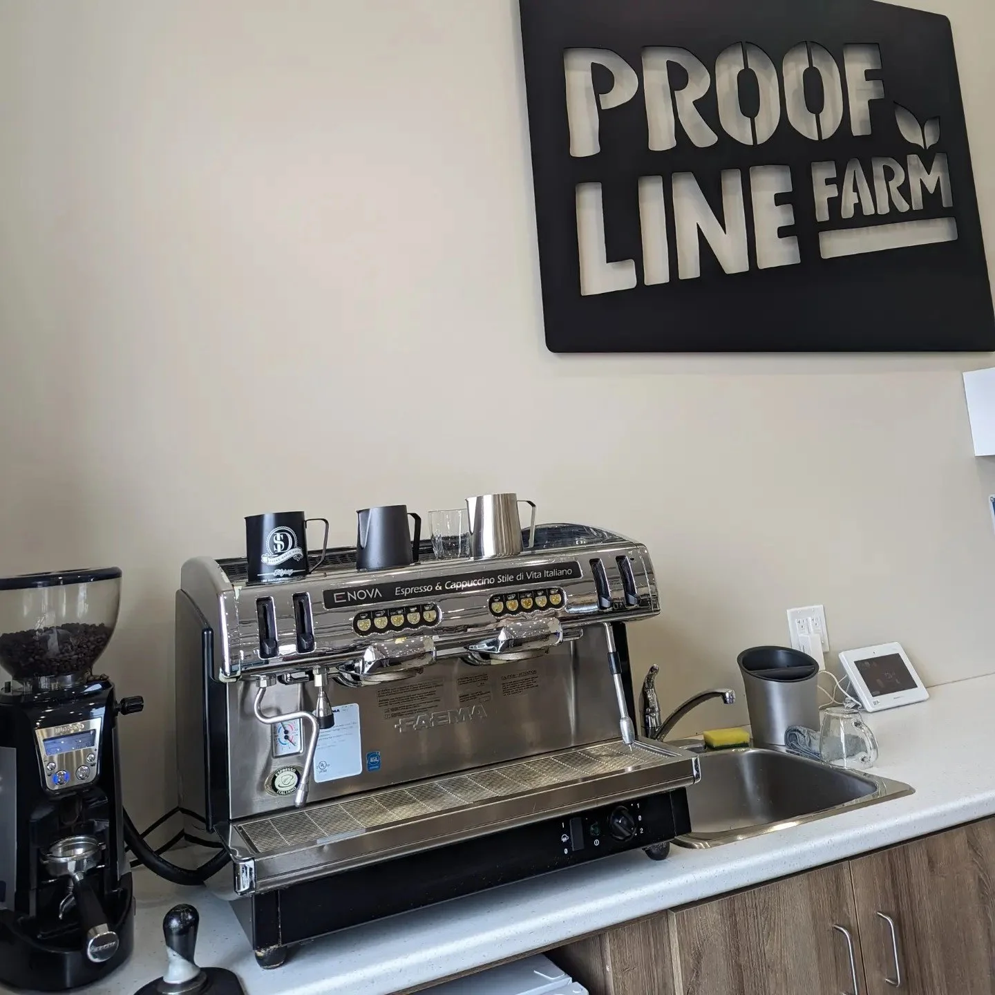
Proof Line Farm logo in the wild


Family-Friendly Farm Brand
It was so much fun to craft this new brand identity for Proof Line Farm. It’s something that can be further developed through product packaging and on their website in the future. It’s always exciting to create identities that use illustrations and take a fun approach to branding. See a video preview of the visual identity process below. You can check out Proof Line Farm’s creamery just outside of London, Ontario.
“We loved working with Mel Groulx at here at Proof Line Farm! Mel's fun and punchy personal branding stood out to us as we searched for a graphic designer online since we wanted to take our brand in a similar direction. We loved the process of working with her to develop a look for Proof Line Farm that we are so proud of. Her rates are also very reasonable for the quality of work and she's local ❤️ 10/10 highly recommend for any small businesses out there that are looking to freshen up their look 🙌” - Janan McNaughton, Proof Line Farm