
Let’s Talk Science
Cohesive Branding Across Programs
Over several years, I’ve partnered with Let’s Talk Science to design cohesive visual branding that connects STEM educators, volunteers, and youth across Canada.
Let’s Talk Science is a leading national nonprofit organization dedicated to STEM education for children and youth, helping them develop the skills needed for future careers in science, technology, engineering, and mathematics.
This portfolio highlights select projects, including program branding and visual identities for Mission: Innovation, Lunar Rover, and Living Space, as well as the 30th Anniversary year. It also showcases organization-wide design, demonstrating how thoughtful, cohesive branding supports the nonprofit’s STEM education mission nationwide.
Client
Let’s Talk Science, National Charitable STEM Organization
Location
London, Ontario & Canada-wide
Services
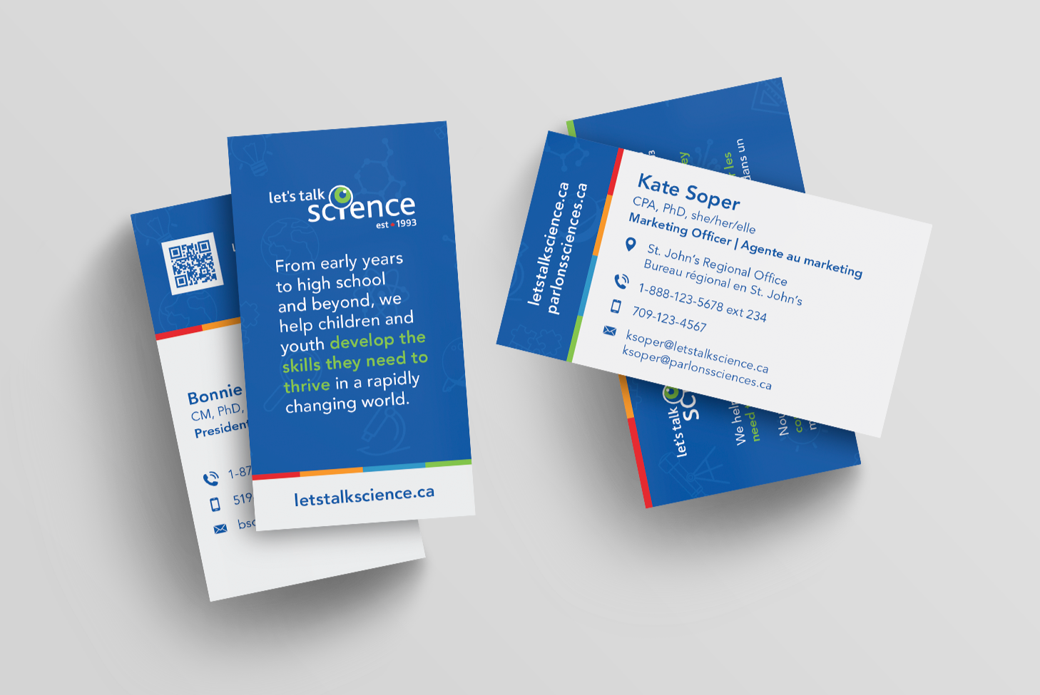
Brand Identity, Logo, Graphic Design, Illustration, Advertising, Stationery
My Approach
The Challenge
My approach to Let’s Talk Science’s overall branding focused on creating a fresh, cohesive, and modern visual identity that works seamlessly across all programs and initiatives. Many of their existing marketing materials were dated, so the goal was to establish a clean, approachable, and versatile design system that could unify the organization’s diverse divisions while remaining recognizable and engaging.
The Solution
This included refining the main logo, developing several new program logos, creating a consistent color palette across initiatives, and standardizing overall design to ensure clarity across both print and digital platforms. The updated branding helps Let’s Talk Science communicate its offerings effectively, while presenting a professional, inspiring, and recognizable identity to educators, volunteers, and youth nationwide.
Click on a program to explore


Living Space - Program Rebrand
Let’s Talk Science’s Living Space program underwent a refresh to align with its evolving focus and the organization’s updated visual direction. The new brand identity needed to reflect the program’s shift toward studying the carbon and water cycles and empowering youth to explore ways to improve environmental conditions and air quality, while still nodding to its space exploration roots.
The redesigned logo brings together elements that represent both continuity and change:

Carbon / Water Cycle
Circular arrows to symbolize flow and connection

Space Legacy
A planetary ring referencing the program’s origins

Circle
A link to the Let’s Talk Science logo, for brand cohesion

Environment
A leaf motif to highlight environmental learning
Primary Logo
The final design includes English and French primary logos for national use, as well as secondary and bilingual versions (pictured below).
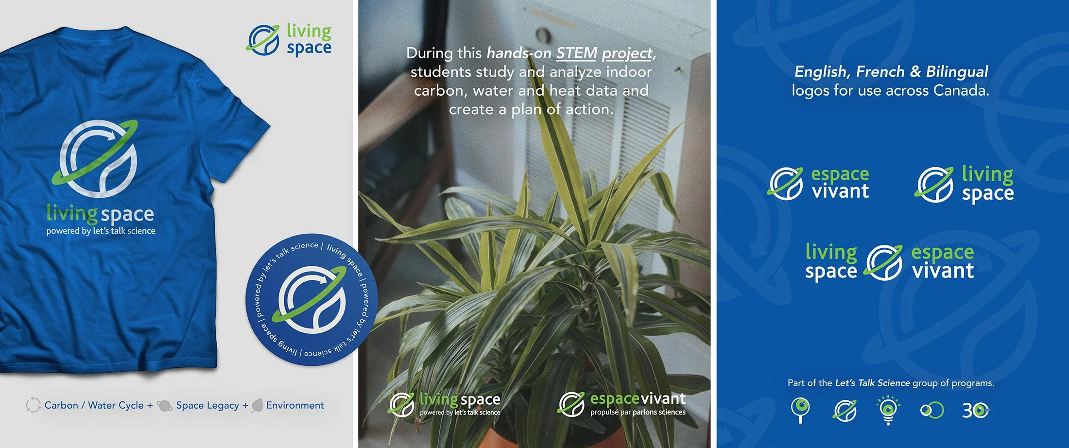
Secondary Logos
I created a “Powered by Let’s Talk Science” variation to integrate primary brand awareness, and a stacked version for smaller spaces.
Bilingual Logo
It was important to have a standalone bilingual version for use across Canada in both English and French.
The refreshed Living Space identity delivers a modern, unified look that reflects the program’s environmental mission and integrates seamlessly with Let’s Talk Science’s overarching brand system.

Before
After
Mission : Innovation - Program Branding
Mission : Innovation is a national Let’s Talk Science program designed to help students develop the skills and mindsets essential for becoming true innovators. Grounded in human-centered design, the initiative encourages creativity, problem-solving, and collaboration, core elements reflected in its new visual identity.
The goal was to design a logo that seamlessly fits within Let’s Talk Science’s existing blue and green brand system, while standing out as a distinctive program mark. What made this program unique, was that the program name itself was bilingual, so it would be consistent across English and French. I made use of the colon (:) from the program name and integrated it into the icon design.
The following elements were brought together to capture the program’s focus on inquiry, design thinking, and discovery:

Lightbulb
Symbolizing ideas, clarity, and innovation

Eye
Connects the program to the overarching Let’s Talk Science brand

Colon
The colon in the middle is what keeps it bilingual with just one version
Primary Logo
The final design works in English and French due to the program naming. The colon (:) is subtly worked right into the lightbulb icon. Secondary versions were developed as pictured below.
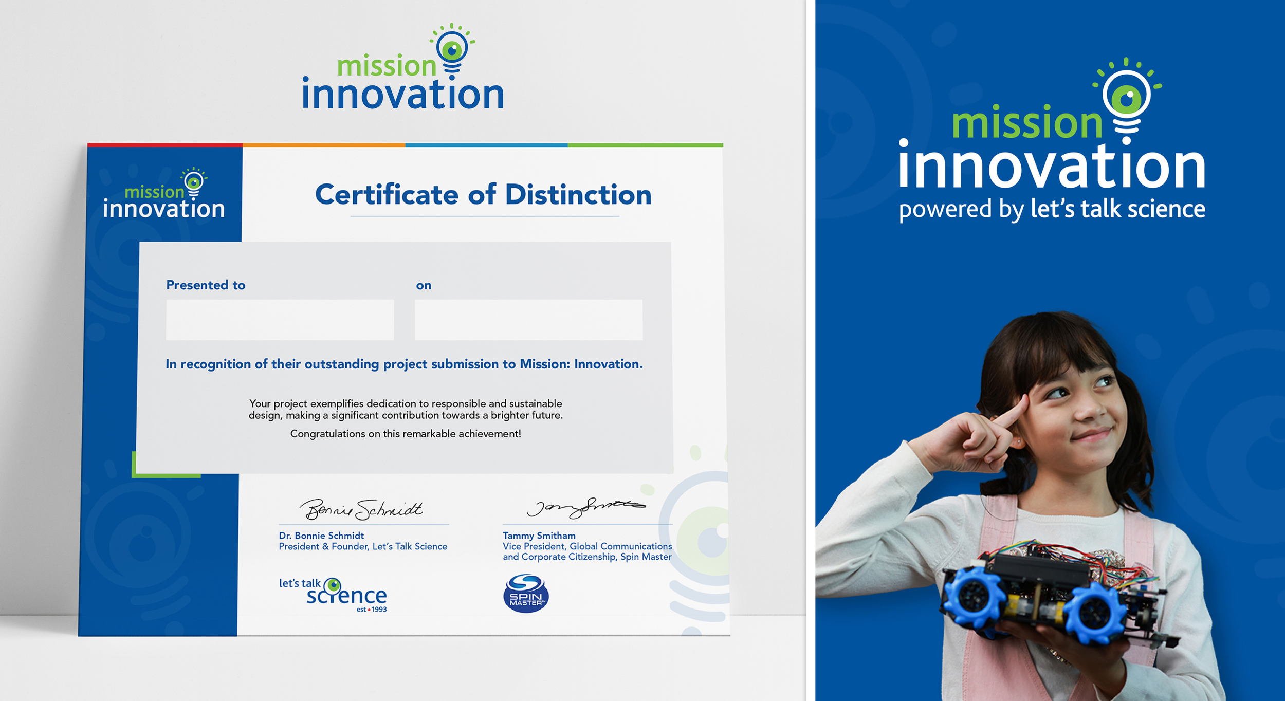
Secondary Logos
I created a “Powered by Let’s Talk Science” variation to integrate primary brand awareness, in both English and French.
The result is a cohesive, modern mark that captures the program’s focus on innovation and its links to Let’s Talk Science. It helps educators and students see innovation as an accessible, hands-on process.
Lunar Rover - Program Rebrand
Let’s Talk Science, In partnership with the Canadian Space Agency, invites students to design a rover mission to explore frozen water at the Moon’s south pole. The Lunar Rover Research Challenge blends scientific exploration and teamwork through an interactive classroom challenge, teaching students the process of engineering, testing, and discovery.
The new brand identity needed to align with Let’s Talk Science’s visual system while evoking the program’s space-focused theme. The resulting logo integrates moon imagery to represent the program’s core mission, along with orbital and circular elements that echo both the Moon’s path and Let’s Talk Science’s signature circular imagery.
This balance between thematic imagery and brand consistency ensures that Lunar Rover feels at home within the organization’s program family, while standing out as a visually strong identity that sparks curiosity and excitement about space exploration.

Moon
Moon imagery to tie in the rover’s mission on the moon

Orbit
Orbital elements echo the moon’s path and Let’s Talk Science’s circular imagery
Circle
A link to the Let’s Talk Science logo, for brand cohesion
Primary Logo
The final design includes English and French primary logos, as well as secondary and bilingual versions (pictured below).
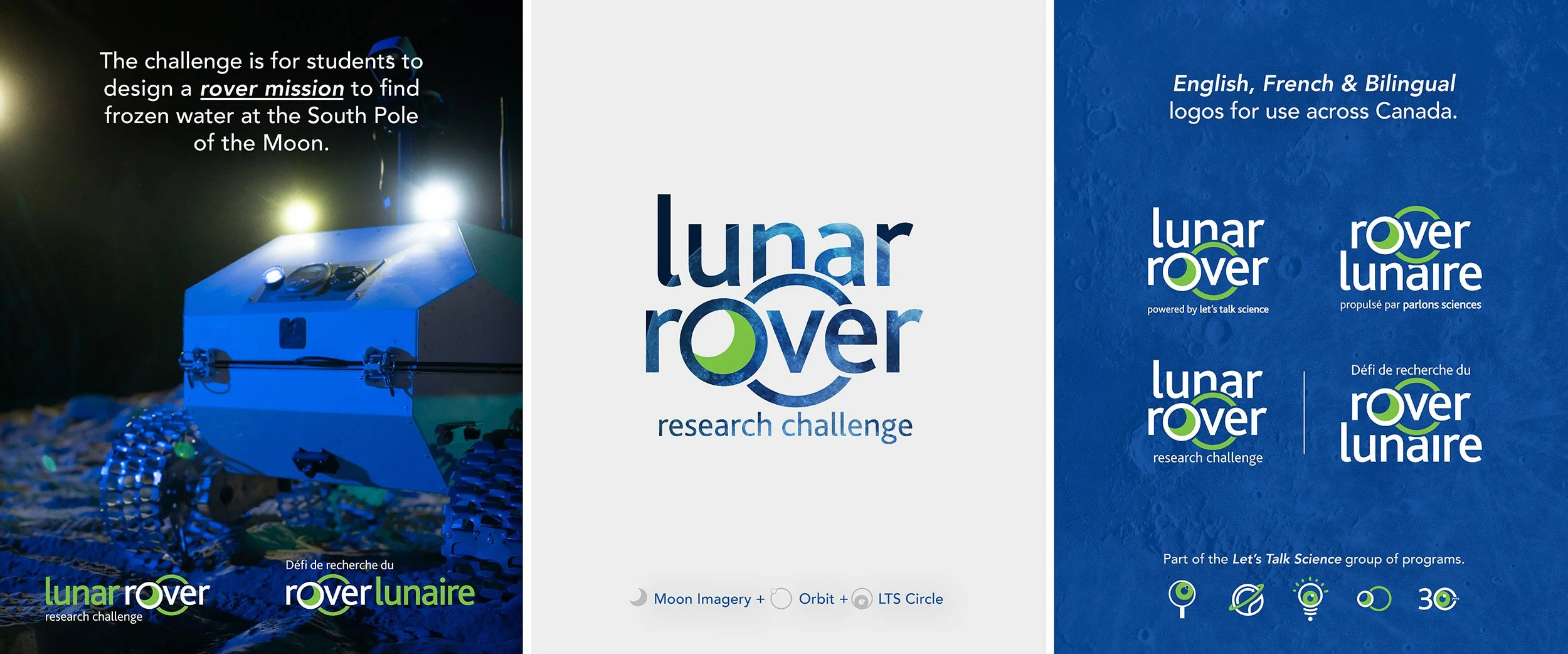
Secondary Logos
I developed a horizontal version of the logo and a “Powered by Let’s Talk Science” variation to go with the series of program logos with the same message.
Bilingual Logo
Like all Let’s Talk Science programs, there is a standalone bilingual version for use across Canada in both English and French.
The new Lunar Rover identity ensures that the program feels at home within the organization’s initiatives, while standing out on its own to spark curiosity and excitement about space research.
Before
After
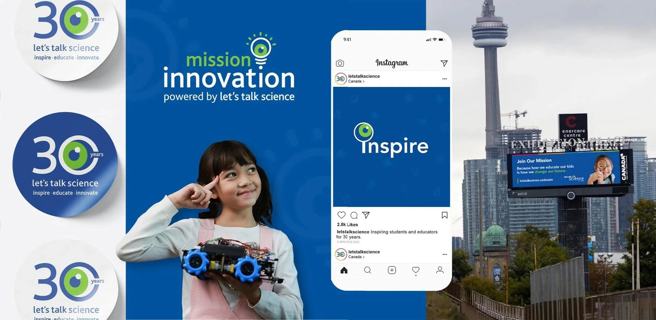
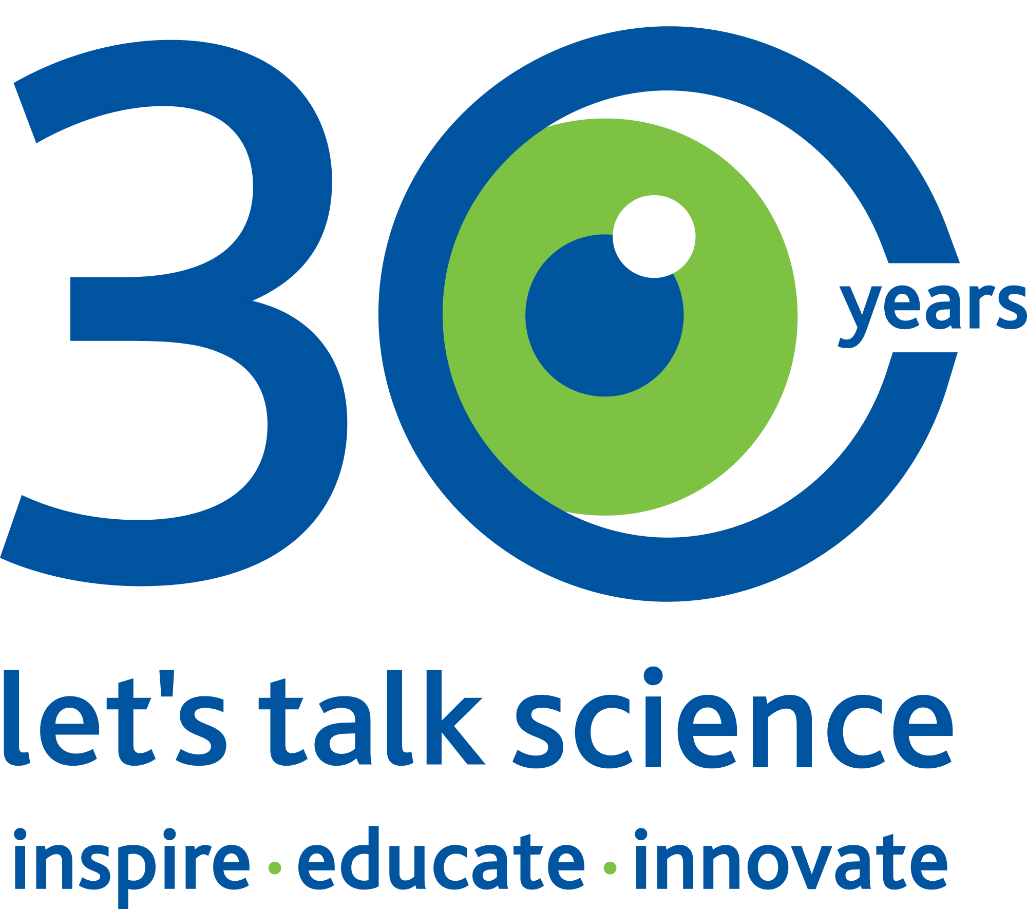
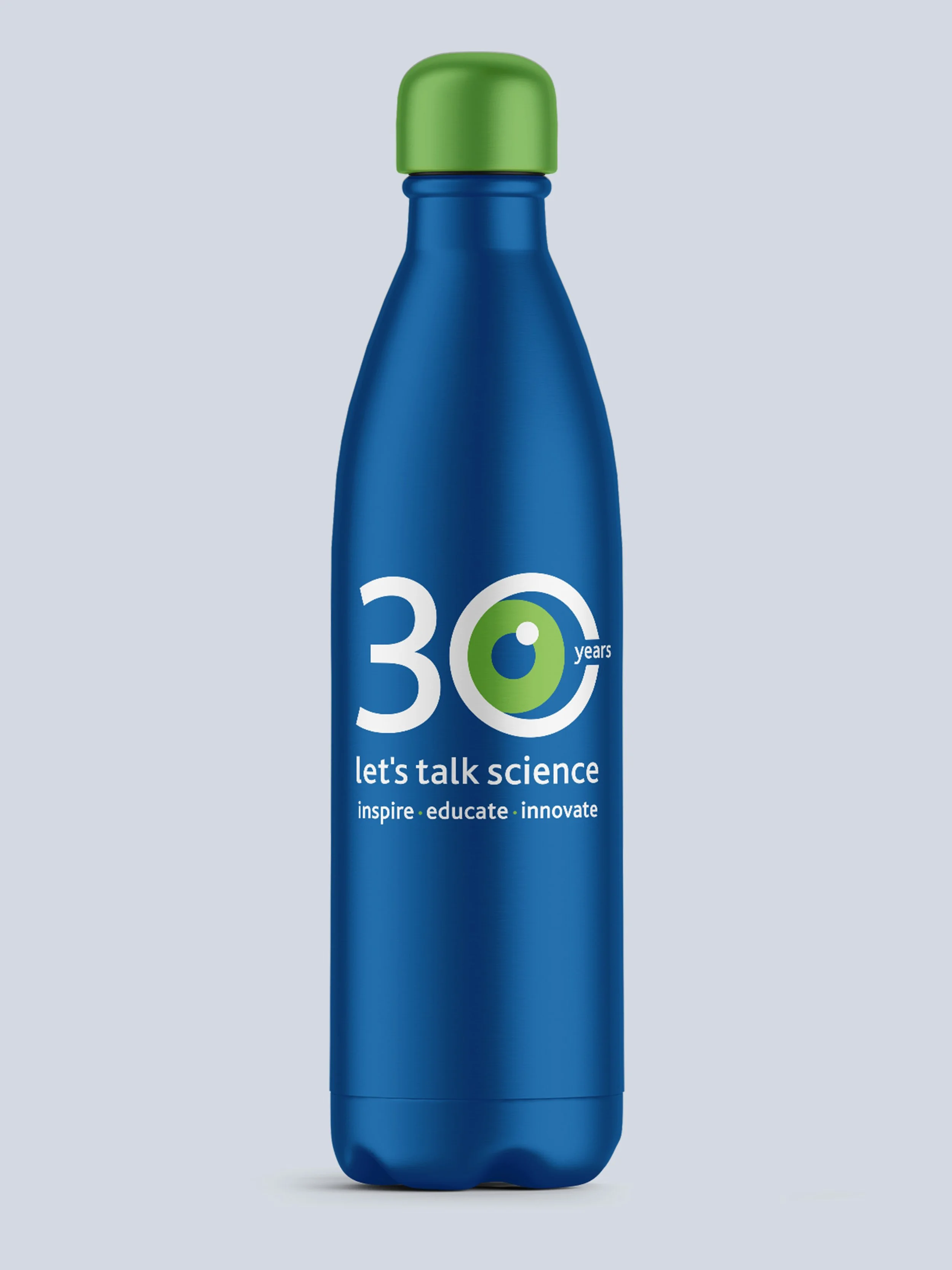
30th Anniversary Campaign
To mark 30 years of inspiring Canadian youth in STEM, Let’s Talk Science launched a year-long anniversary campaign celebrating its impact and legacy. The visual identity for this milestone was designed to complement the organization’s vibrant and professional education branding, while introducing celebratory elements that reflect its longevity and national reach.
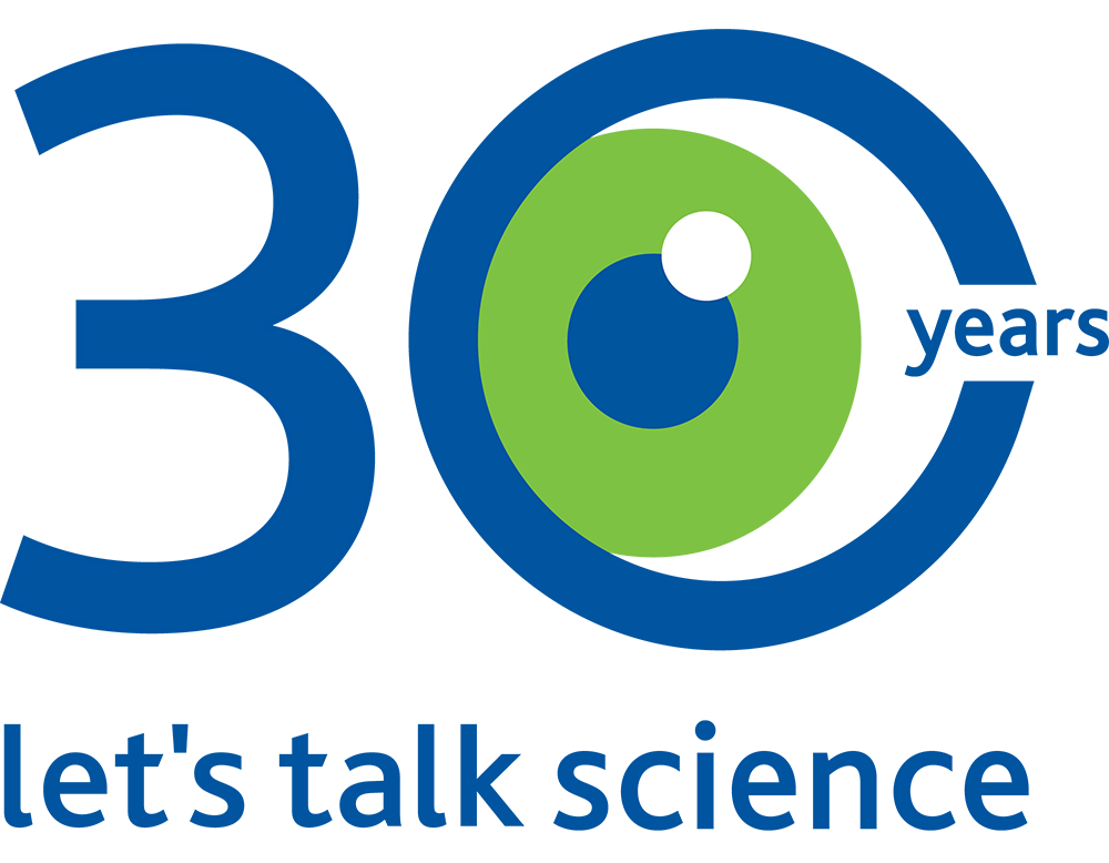
The logo system incorporates iconic imagery, including:
Magnifying Glass / Eye
Let’s Talk Science symbol reimagined within the '‘0” of the 30

30
Celebrating three decades of inspiring youth in STEM

Canada
Meaningful nod to Canadian roots for national pride
Primary Logo
A refined version of the original logo featuring a red maple leaf to honor 30 years of Canadian STEM education, in both English and French. Secondary and bilingual logos are listed below.
Secondary Logos
A bold anniversary mark featuring the magnifying glass eye within the “0” of 30, symbolizing curiosity and discovery at the heart of Let’s Talk Science’s mission.
Bilingual Logo
A side-by-side “est. 1993” logo presented in both national languages, designed for clear, inclusive use across Canada’s bilingual communications.

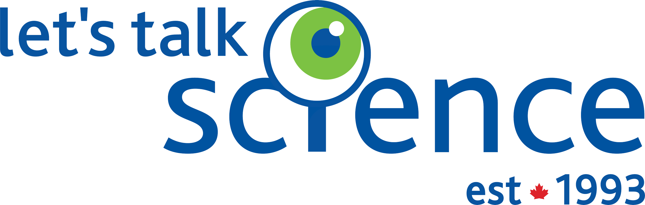
See below for a before-and-after comparison of the previous Let’s Talk Science logo and the updated version. To improve legibility across various platforms and backgrounds, the “Let’s Talk” text was changed from light green to a darker blue. The “est. 1993” mark incorporates Let’s Talk Science’s signature red through a Canadian maple leaf, reinforcing national identity. Gradients and shadows within the magnifying glass were removed, resulting in a flatter, cleaner, and more modern look.
Before
After
This anniversary branding unites celebration with credibility, reinforcing Let’s Talk Science’s position as a trusted, forward-looking leader in STEM education for children and youth across Canada.
Let’s Talk Science - Unified Brand
Beyond individual programs, Let’s Talk Science maintains a cohesive, versatile brand that unites its diverse initiatives under a consistent visual identity. Each program, and milestone initiatives like the 30th Anniversary, has its own distinct logo and identity while adhering to the organization’s core branding elements, including signature colors, typography, and the magnifying glass motif. This balance allows for program-specific expression within a unified system, ensuring all touchpoints feel connected and recognizable.
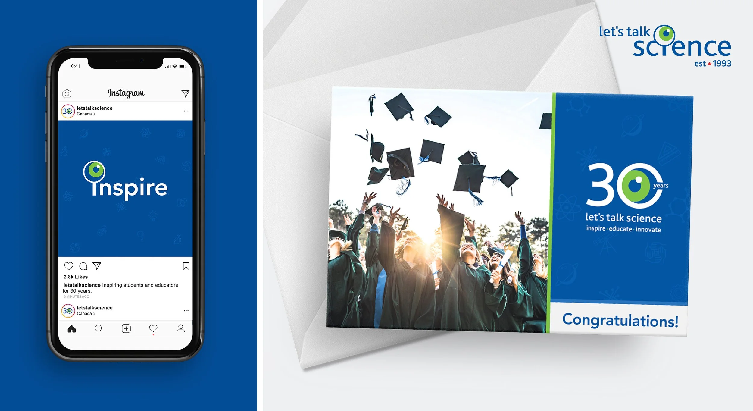
Social Media & Ads
Here’s a sneak peek at a range of digital and print advertisements created for Let’s Talk Science. These ads highlight their comprehensive STEM programming, educator resources, and youth-focused initiatives. They appear across national publications, educational events, billboards, and digital/video platforms, all while seamlessly blending with the organization’s education branding to create a cohesive visual experience.

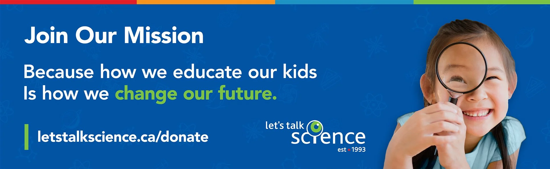
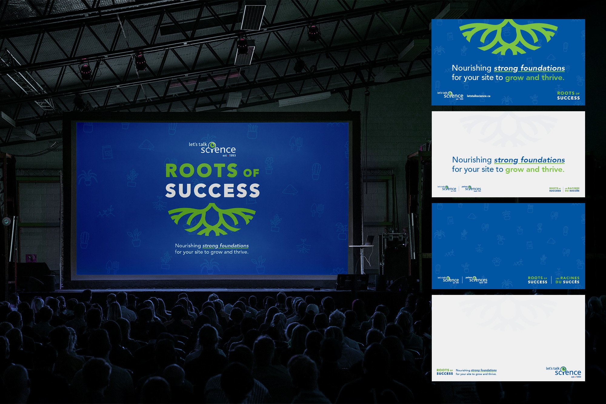
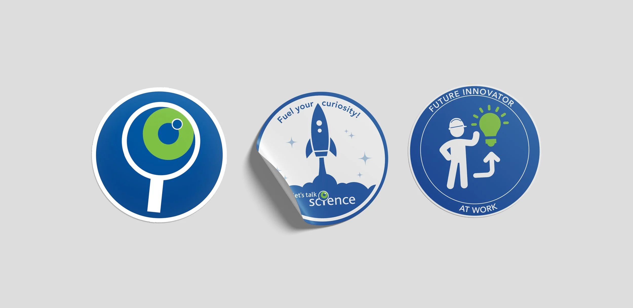

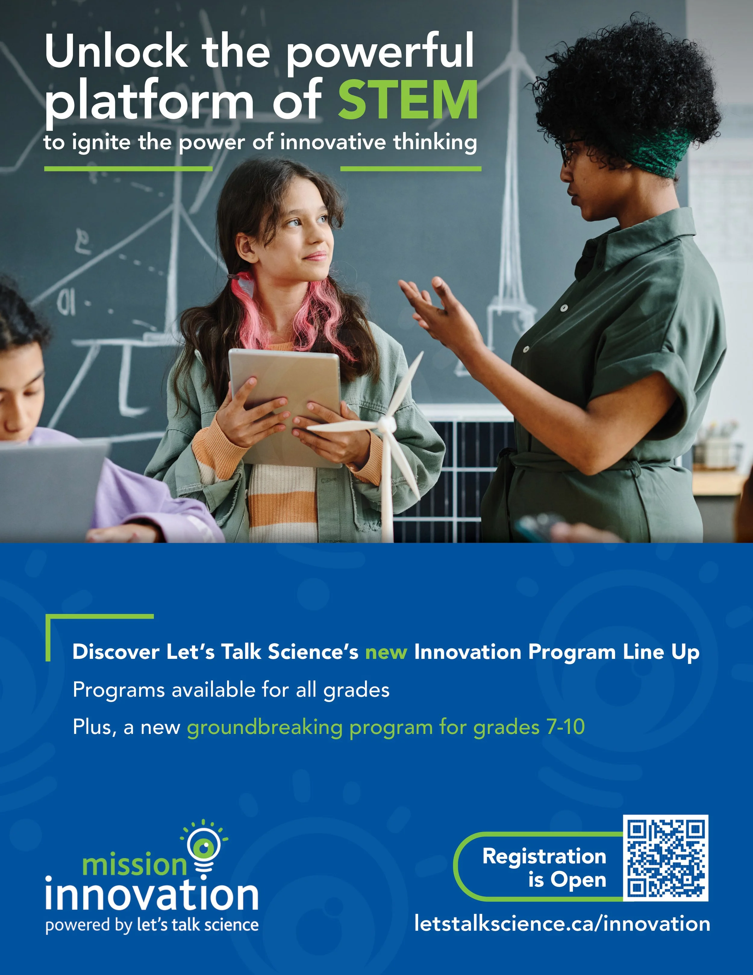
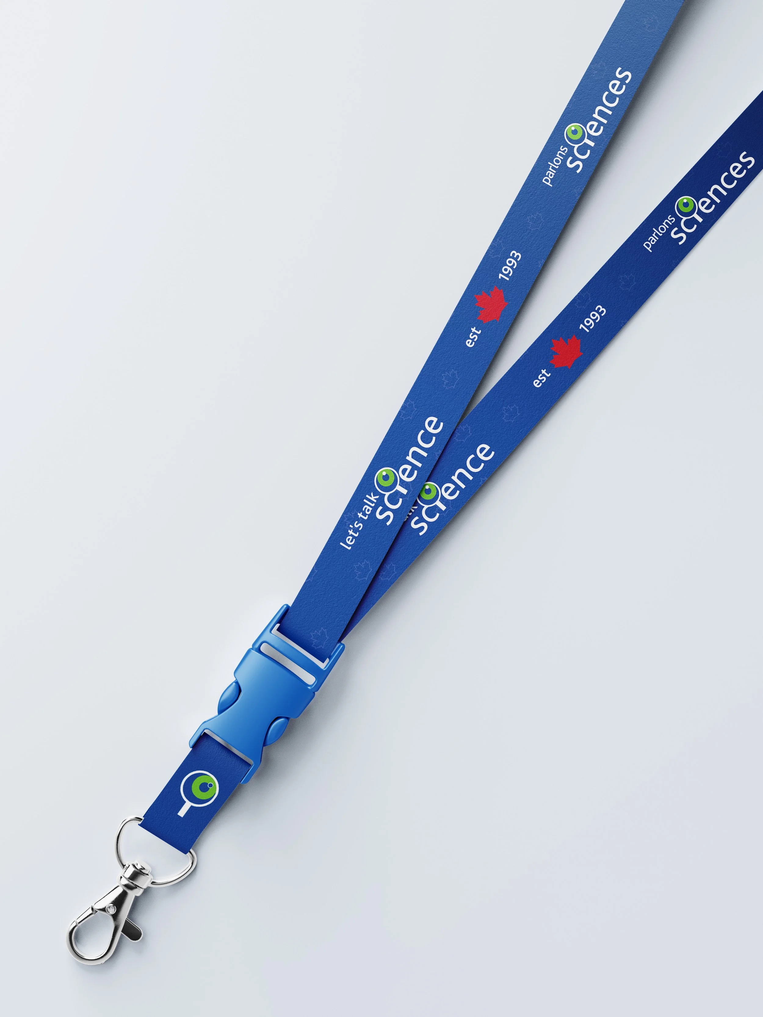
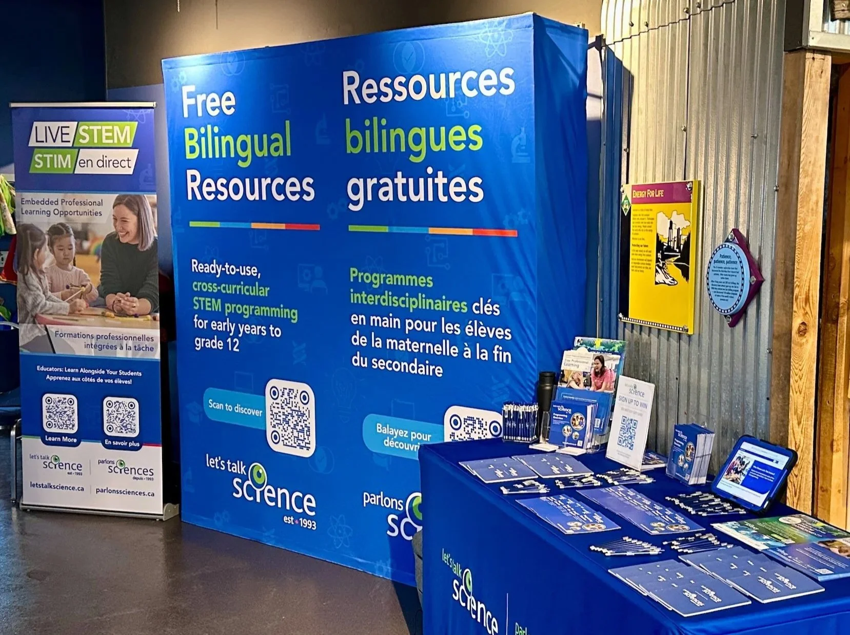
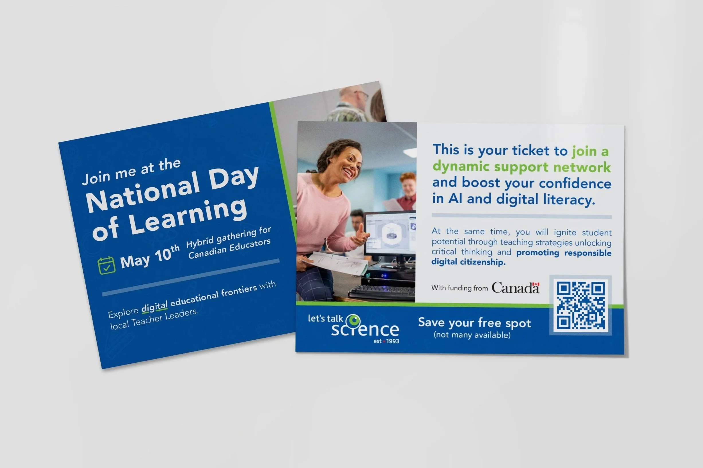
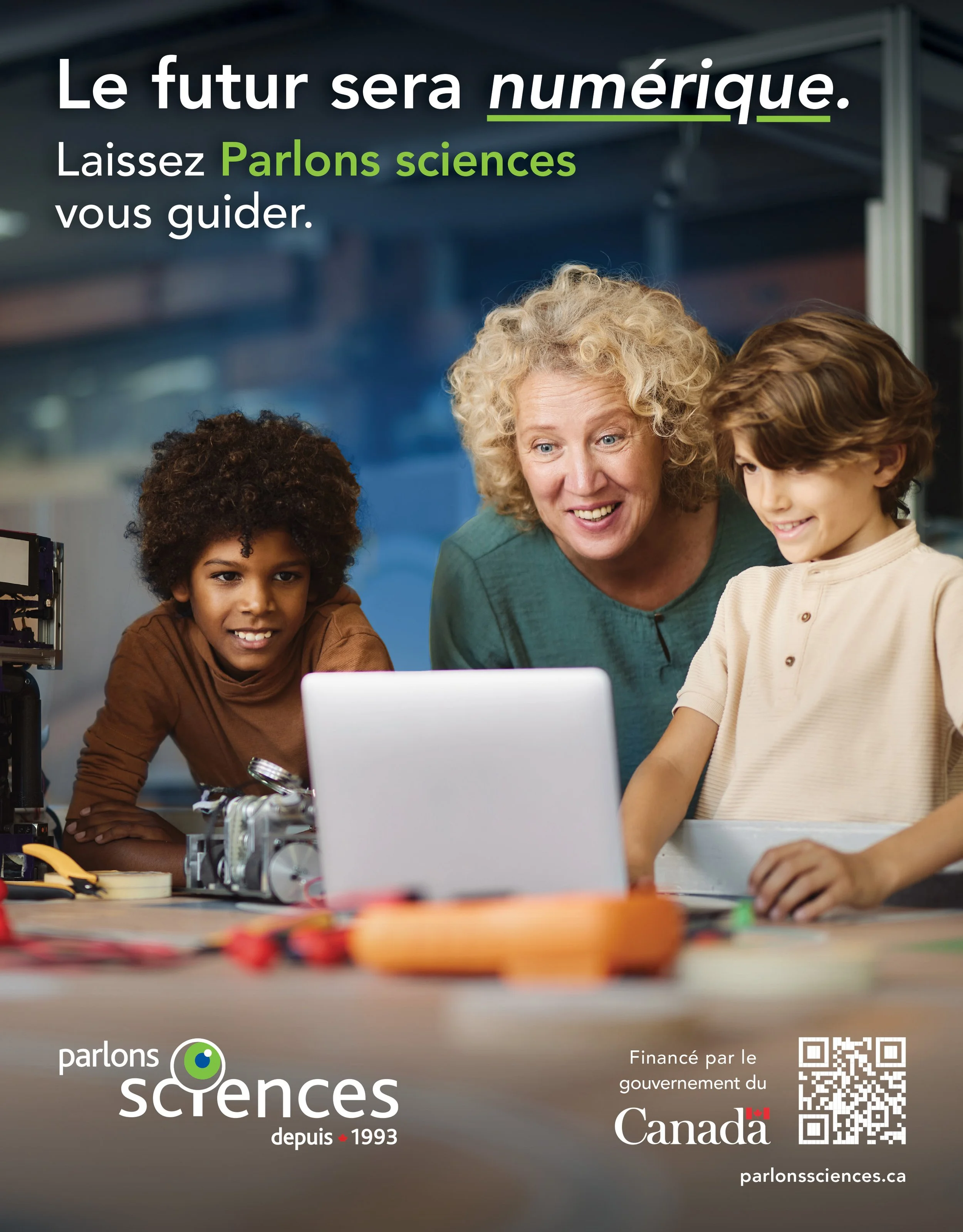
Fun, Impactful Education Branding
These playful yet polished designs reflect the organization’s spirit, making STEM education exciting and accessible for youth nationwide. The flexible visual system adapts easily across social media, print, and video, ensuring every piece looks unified, modern, and full of energy.
Below, explore a video preview showcasing Let’s Talk Science’s designs in action. For full details on the Let’s Talk Science programs, visit their website.